Why coronavirus death rates won’t fall as quickly as they rose
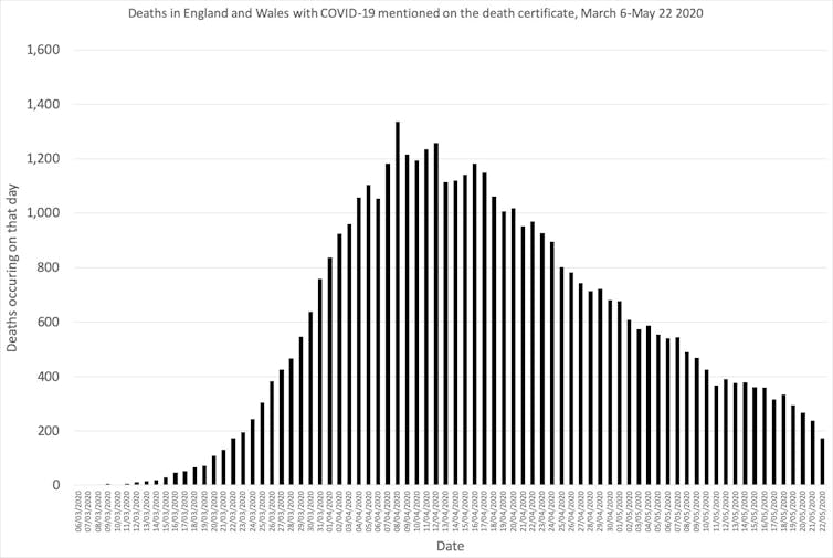
Coronavirus deaths shocked us with how rapidly they rose from a base of none at the start of the year, to many thousands within the space of mere weeks. At the peak for England and Wales on April 8, more than 1,300 people died in a single day (as revealed later when all death registrations were reported).
But the other side of the peak will look very different: death rates will fall much slower than they rose.
The latest data for England and Wales shows that 44,401 people had died with COVID-19 mentioned on their death certificates by May 22. For the majority of these people, the disease will have been the primary cause of death.
The first graph below shows the number of deaths daily by date of death in England and Wales as a whole. There has been no sudden break in slope. This is because the national curve is an amalgam of many smaller, local curves.
Most of these local curves will be symmetrical, with deaths falling at the same rate as they rose, but with the outbreak affecting different areas, at different times, together they create the long tail we see in the graph below.
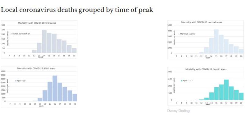
To illustrate how the overall national trend will fall more slowly than it rose, I have taken all 339 local authority districts in England and Wales for which data has been released and sorted them into groups by the week in which COVID-19 deaths peaked.
Doing this gives us seven groups, starting with the week of March 21 to March 27 and ending with the week of May 2 to May 8. The first such grouping is of those districts which recorded their highest number of coronavirus-related deaths in the first of these weeks.
The places in which COVID-19 peaked first are a disparate set of areas, only one of which was a London borough, which indicates just how widespread the disease had become by March. They included Wolverhampton, Lambeth, Newport (in Wales), Chiltern, Fareham, South Staffordshire, Broxbourne, Erewash, Rochford, South Bucks and Tunbridge Wells.
Grouping local authority districts by the week in which mortality with COVID-19 peaked helps break down the national pattern into a series of smaller, local curves. Only the first four graphs are shown as 92% of all deaths occurred in these district groupings. Each appears to be very similar to the next except that the vertical scales on each graph vary because more areas saw deaths peak in early April.
The numbers of deaths in these different sets of districts rise quickly and then fall slightly more slowly over time. But they do not fall as slowly as the first graph shown in this article.

Danny Dorling
The full lockdown in England and Wales began on March 24, during the week in which deaths peaked in the first set of areas shown above. People were already social distancing to some extent before that date, so we should not expect to see any sudden drop in mortality two or three weeks after that date in the graphs above, and we do not.
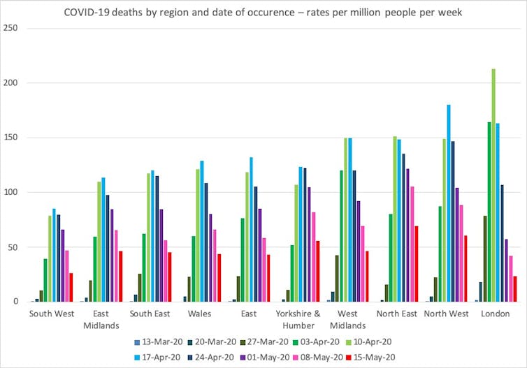
The final graph in this series shows the regional distribution of the spread of the pandemic. The regions are sorted from lowest overall rates of mortality (south-west England) to highest (London). Rates have fallen the most in London because – by region – the disease peaked there earlier. It fell more slowly in south-east England.
Slowly the pattern is becoming more clear. Deaths are falling slower than they rose, but they are falling steadily. Only very occasionally does an area report a rise in mortality and almost always, the week after, numbers fall again very rapidly.
Despite fears of an immediate second wave there are no signs of this yet from the mortality data that is being released each week, and no sign that we should greatly fear one in the coming weeks.
The degree of surveillance of COVID-19 is unprecedented in comparison to previous epidemics. In this article I have only considered deaths from the disease, but there is also close monitoring of hospital admissions, testing, even internet searches for symptoms. Much of this effort has been criticised as not being enough, but it should be good enough to spot a second wave beginning, if one does.
As lockdown is only lifting now, many people wouldn’t expect to see a possible second wave yet. But the fact that we have not yet seen second waves in similar countries that locked down earlier than the UK, such as France, Spain and Italy, should give us some hope.
The disease will fall away more slowly than it rose. But at least it is now safe to say that it is falling everywhere.
![]()
Danny Dorling, Halford Mackinder Professor of Geography, University of Oxford
This article is republished from The Conversation under a Creative Commons license. Read the original article.
Oxford is a subscribing member of The Conversation.
Find out how you can write for The Conversation


